Spotify overdid "copying" from other apps
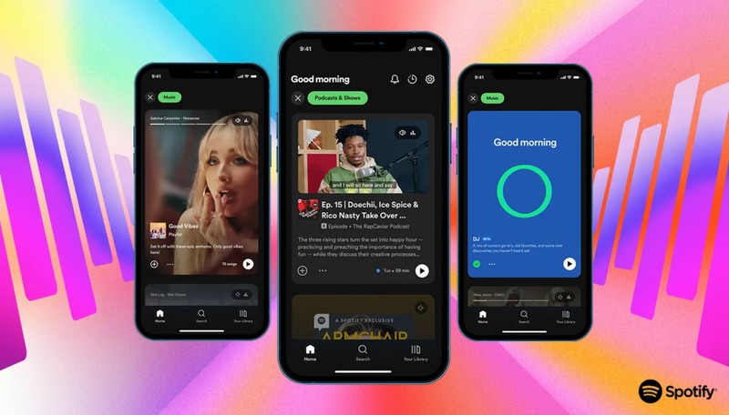
Spotify's redesigned homescreen is similar to a combination of TikTok, Instagram, and YouTube.

Spotify, which is among the most successful music listening applications, may have exaggerated the issue of copying from other applications with its renewed interface. From time to time, all applications can be affected by each other and take both certain features and interface from each other, but Spotify seems to have gathered a copy of all applications with its new interface.
Spotify's new homescreen is a mix of other apps

The upgrade includes a feed that is more heavily focused on images and scrolls vertically, similar to the design of social media sites like Instagram and TikTok. It is true that TikTok has changed so many things when it was introduced, many apps tried to copy the specifications of the short video format atpp. Daniel Ek, the CEO of Spotify, hopes to draw over 50 million "audio producers" to the platform with the redesign as the company positions itself as more than just a music app. The redesign of Spotify represents the company's larger goals.
Users can now tap on "Music" or "Podcasts & Shows" to access a vertically scrolling feed that mimics Instagram Stories, TikTok, or YouTube Shorts. The top portion of the app will still feature album and playlist covers.
 Delaying for perfection: Starfield's release date pushed back to SeptemberGame


